

It's an illustration for an article called "Dances with Wolves", sort of a "man vs. car salesman" thing.
Turnaround times for weekly magazines are notoriously short. In this case the email from the art director came in at 11:00 pm on a Wednesday night.
Thursday morning I received and read the text for article, did some research, and started sketching. The rough sketches went out at 1:00 pm. It doesn't take that long to actually generate the sketches, but it does take a little time for the ideas to "bake in", so to speak. You really need to get to know the character, his environment, how he might carry himself, how he would dress, etc. If this were an established character I'd only need to worry about conveying his story of the day - but here I need to first establish the character for the audience, and then also tell his current story. This means (as usual) everything in the picture must contribute to the narrative or it has no place in the scene. By 2:30pm I had an approved sketch and was ready to paint - the image was due 24 hours later, at 3:00 pm Friday. Of course I was aiming for earlier, and fortunately managed to get it out by 1:00pm Friday.
Thursday morning I received and read the text for article, did some research, and started sketching. The rough sketches went out at 1:00 pm. It doesn't take that long to actually generate the sketches, but it does take a little time for the ideas to "bake in", so to speak. You really need to get to know the character, his environment, how he might carry himself, how he would dress, etc. If this were an established character I'd only need to worry about conveying his story of the day - but here I need to first establish the character for the audience, and then also tell his current story. This means (as usual) everything in the picture must contribute to the narrative or it has no place in the scene. By 2:30pm I had an approved sketch and was ready to paint - the image was due 24 hours later, at 3:00 pm Friday. Of course I was aiming for earlier, and fortunately managed to get it out by 1:00pm Friday.
The art director asked for one sketch - I told him I tried out three or four different approaches, to which he replied, "well don't do that again!" (meaning, "you shouldn't have gone to all that trouble!")
The basic story line is about a customer having to contend with a menacing salesman in order to get the car he desperately wants.
We talked about having the salesman sort of standing as a literal barrier between the customer (and by extension, the reader) and the car:

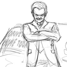

And more of an evil supervillain kind of approach with the car keys sitting on the desk. He's sort of saying, "if you do exactly as I say maybe you can have this car.":

He went for the last one, my favorite too. We agreed that given the small size (approximately 3" x 3") this would allow us to keep the character's face larger, and also the storytelling was more compelling, slightly over the top (maybe over the middle?). Kudos to Philip for choosing the layout and composition with the most potential, vs. just going for the one that simply happens to have been drawn better (I hate when they do that).
With an approved sketch in hand I got to work setting up the painting. First I tweaked the rough sketch a bit to make it graphically stronger. Using Photoshop's warp tool I bent and elongated the head, made the arms and body a bit more slender, and made the gesture more unified and powerful. This basically gives the silhouette a stronger footprint, so to speak.
Then I laid in some basic colors and values for the main elements, working under the rough drawing layer.

At this point my main goal is to get past the reliance on the initial line work, so the figure stands on its own with just value shapes. I start painting over the drawing layer, repeatedly hiding it to see if the paint work is solid enough to get rid of the line drawing. Almost there...

Finally I'm able to get rid of the rough line work and get the thing down to a single layer for the figure (plus one for the exterior, one for the window bars, and one on top for the desk). Now I'm really painting!!

I felt like the blue suit was a bit too colorful, so I toned it down.

After four hours of painting I went to bed feeling pretty good about where the picture was. "Probably shippable", as we say:

A bit of polish Friday morning... (those white styrofoam coffee cups are so 20th century... and that simple paper key ring had to go).

At this point I "remembered" (that is to say, I re-read the brief), that the character is said to wear "flashy shirts." Oops. Sometimes you get rolling so fast you neglect certain critical details. Thanks to Photoshop, of course, that is not a problem. I tried out a few colors for the shirt: yellow, pink... blue seemed to work best (looks flashy enough, but is not a distraction or focal point).
I also wasn't happy with how the head was melting into the background a bit due to the character's hair being white (which it had to be) against the light background. For some purposes this would be great - it actually focuses the viewer on the character's face. But for this application I wanted a little bit more of a flat, graphical appearance. So I added a tasteful (I hope) hint of an outline around the hair (and also added this to some other parts of the figure and the background, for consistency). This is, of course, kind of backwards... but whatever works...
I also wasn't happy with how the head was melting into the background a bit due to the character's hair being white (which it had to be) against the light background. For some purposes this would be great - it actually focuses the viewer on the character's face. But for this application I wanted a little bit more of a flat, graphical appearance. So I added a tasteful (I hope) hint of an outline around the hair (and also added this to some other parts of the figure and the background, for consistency). This is, of course, kind of backwards... but whatever works...

The keys, documents and pen tell the immediate story, that a sale is (potentially) about to happen, while the coffee cup and mouse tell a more general side of the story (this guy's day to day life and routine).The character's facial expression and body language tell who he is in the general sense (his predatory mode of operating) and also what he's doing to the customer / reader right now.I think this is a good example of some simple but concise storytelling - just a few components to create the character, place him character in his setting, indicate what's going on, involve the viewer as well - all driven and tied together by some basic triggers that anyone can easily read and understand.
Great post, Chris. Fascinating to see how this illustration came into being. I remember admiring it on your website recently and certainly never imagined something of such quality could have been painted so quickly. Do you find the pressures of a tight deadline can sometimes be a good thing in this respect? Or to put it another way, if you'd had a week or two to do it, would it have taken you a week or two, but possibly with the same result? I was impressed that even when you had taken the image to the 'shippable' state as you call it, you didn't just settle for that. Those last subtle changes really gave the picture a nice polish. And the necessary shirt change was a blessing in my opinion - I think the blue colouring adds more interest to the picture as a whole. Fantastic work!
ReplyDeleteThanks Kevin, and yeah, personally I find that the more constraints I have often the more powerful the work is! One of the things I struggle with when making pictures is I can be indecisive (and working digitally can encourage this), so if presented with a completely blank slate I may waffle around a bit. I actually love having a very focused "mission," including a tight time frame. It keeps my inner waffler quiet. "Shut up, we don't have time for that!" Sometimes ANY decision is better than NO decision. Also I find with picture making there is sort of an inherent time limit for me, after which the picture kind of closes itself off for me. It's sort of like burnout, I guess. So short deadlines can be a good thing.
ReplyDeleteI call attention to the "shippable" thing because with commissioned work you have to hit a (vaguely) objective standard, and until you get there the dynamic is very different. It's more like survival mode. After you get there it's, "now let's see what we can do with this thing." It's sort of like, once you've seen to your basic survival needs, then you can think about a hobby and some recreation. At least that's how I work.
Lastly, to give you some sense of timing (friends tell me these details are informative...), I would never take a week or two to do a piece like this, in any case. Keep in mind the image is small (about 3"x3", which is only about 900x900 pixels; I rendered it larger than that, though). Normally I would never spend more than three days on something like this. Probably two at the most, but if it were for a label or something it'd be a lot more. Usage has a lot to do with it - with magazines (like this) these things are seen once. With packaging they're around for a very long time.
Thanks Chris. I can relate to the inherent time limit you mentioned there. Although I'm not a commercial illustrator like yourself, I do find that my enjoyment of a painting quickly starts to wane if it drags on too long ('too long' for me is usually anything over a week). I'll often put it aside and come back to it later when it feels fresh again. But the trouble with that is I can end up with a growing pile of unfinished artwork, which can start to have an oddly corrosive effect on my morale.
ReplyDeleteCommissioned work is different of course, and I like having to work within the timeframe I've agreed with the customer since it keeps me focused. But for personal projects, portfolio pieces, gallery work etc I have to try and self-impose a deadline, which isn't necessarily easy to stick to.
Out of curiosity, do you ever set yourself a time limit for something that doesn't otherwise have one?
And if you don't mind another question...(sorry!!!) have you ever set yourself a brief when you were working on non-commissioned work? I wonder if doing that might help me stay more focused on the illustration pieces I'm trying to do for practice.
Cheers, Kevin
Hey Kevin, yes to both points. This piece is one of just a handful where the deadline was the limiting time factor. Usually I impose my own time limits in order to ensure a certain level of profit margin, and keep myself available for other work. I may have four or six weeks to do a picture that I give myself three days to complete. And yes, I do write full briefs for my own personal work as well. Like you said, it keeps me focused, but also there are a lot of points that are easier to put in writing than directly in picture form... themes I want to explore, similar stories I may want to read, etc.
ReplyDelete