Thursday, August 23, 2012

Finding Pictures in the Clouds

You know that game where you lay on your back, look up at the clouds and try to spot things in their billowing forms? This process, is a sort of Rorschach "ink blot" test  - what the viewer "sees" may say more about him/her than about the ink blot, or cloud!  Really what we "see" is a combination of a) what humans tend to generally be concerned with (creatures, faces, other humans, maybe vehicles), b) the disposition of the individual viewer (insert psycho-babble here), and the nature of the visual (black ink is different from puffy clouds, etc.).

With art-making, though, it's a collaborative endeavor, because we (our conscious selves) can partially drive the process. We may simply be vaguely thinking "serpent" or "dragon" while our hand moves around seemingly randomly, unconsciously.   Is it moving randomly, and our eyes are seeing what we want to see?
Or is the hand responding to the semi-conscious direction?  Who knows? Who cares?!

On top of that, even if the amorphous image is not in any way contrived in advance (maybe it's found in nature, or even made by another artist), we can consciously seek to specifically find what we want to draw, for example, a creature, a person, etc.

Some artists when coming up with, say, a creature concept, will simply "draw 'S' curves." Some scribble and scribble, with only a vague notion of what they are intending to produce, while constantly looking for anything that sparks their IMAGE-ination.  That works!  Me, I like to paint big soft blobs.  Then I either let myself be hope to what comes, OR I decide in advance what I want to look for.


The first stage in this case was completely un-directed. Yet, like SOOO many people, for obvious reasons, I tend to see faces in everything. It doesn't take much. One thing that this process makes even more obvious is the PARAMOUNT ROLE OF VALUE IN SEEING AND PICTURE-MAKING.  When your unconscious mind is struggling to make sense of what it sees, or thinks it is seeing something, you'll find this has very little to do with color.  Yes, I am going to keep saying this in every post.
Anyway, now I seek to clarify what I see... or have decided to see... or think I see... just a bit...


The trick, though, is to keep the "cloud game" going.  I want to clarify what I think I'm seeing, without killing it. Without turning into "that same old arm that I always draw" or whatever. The good thing with digital media is you can constantly look back at a prior version and go, "whoops, I lost it somewhere along the line." I do that a lot.


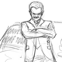
That right arm (on the left side of the picture) - what's it doing exactly? Is it coming toward us? Is it parallel with the picture plane? It's amazing how easily you can destroy the illusion of naturalness.


When you work this way you will produce shapes and forms that you might NEVER come up with consciously. You may see wonderful little hand gestures or facial expressions that open up whole new dimensions of picture-making for you.  When working more consciously, we tend to produce the same kinds of faces, bodies, hands, poses, etc. I'm still not even sure to what extent "I" produced most of them. What it feels like is I SEE them, then very softly bring them out just enough so I'm sure others will see what I'm seeing.


Most artists when working this way (or similarly) tend to produce very similar imagery, over and over.  Poses and faces may vary, but maybe it's always a figure floating in space, or a straight on face, or whatever. This seems contradictory - on the one hand you're producing new imagery that's very different from your usual habits... but on the other hand, you still may find that you very quickly start repeating your (new) self.  The book Art and Fear postulates that maybe each artist has only a few stories to tell, maybe even only ONE story. So be it I guess.


Work like this has an organic and naturalistic quality that is very hard to achieve when consciously directing the work. But the fact that it can't be as easily consciously directed can limit its usefulness for certain kinds of commissioned work.


So, here's the "finished" piece. I call him "Warrior." He could be a lot more finished, I guess.


Try this yourself!  Use whatever medium allows you to quickly "see into" the picture, to see through and beyond the marks.  Then proceed very cautiously, and if possible check back against earlier versions and see if what initially sparked you is still there!

Monday, June 11, 2012

Reference and imagination

Notice I didn't say "reference vs. imagination"

Some artists rely heavily on visual reference, others work solely from imagination. There's nothing wrong with either approach - you can produce great art both ways. The important question is whether or not you are currently using reference in the way that's best for your art and your artistic development. Depending on where you are you may benefit from learning to use reference more, learning to use it less, or learning to use it differently.

If you want to expand your ref-less capabilities, here are two exercises to consider:
1) Force yourself to create an image solely from imagination. Do not give up when the going gets tough, but think, think, think about what you are trying to draw and paint, what its form is like, what that form would look like under the given conditions, etc. When you are away from the image, keep your eyes open for the answers to those nagging questions you couldn't get right - everything from color to anatomy to form and space. Working without reference makes the gaps in your abilities crystal clear, and may be disappointing, even embarrassing. THAT'S A GOOD THING. In fact, as a side note, anytime you look at your work and think "that looks horrible" count yourself lucky that you can see it. The alternative is much worse.

Anyway, back to working without ref - even though you may see some real weaknesses in your ability to depict certain things, at the same time you may find your work has a certain power and personality that was lacking before, and this only improves with practice. When you have to figure out visual things in your own head you understand them in a way that is much deeper, more profound, powerful and personal, and this is reflected in the artwork. Once you've given it your all, I mean really gone to the wall, then you can go obtain some reference material and use it to "fix" or simply check your work. You will likely never forget the answers to the particular questions you struggled with in that picture, whereas you'd used reference from the start it would have been in one ear (or eye) and out the other.

2) Create a painting from imagination, and obtain reference material by sketching only, whether from life or photos.  It's better to draw from life because we tend to empathize and identify with our subject more fully and physically when it or he or she is a real thing. Art-making is not just in the eyes, it's in the body.

Then use the sketches as your reference for the painting. Don't look at the actual subject or photos while painting, just look at your sketches.

To those of you who say using ref doesn't work with your creative process...
I say, yeah, that's true, it doesn't fit well at all.  So just like anything else you need to figure out how to deal with that.  If we could just draw and paint completely from memory it'd be a lot easier to simply "create." For some genres and styles this is quite possible, but for others it isn't. In some cases it is possible, but not necessarily desirable (even though working without ref may feel good, that doesn't mean it's best for your art). Some artists say they're too lazy or, the most common assertion, "I usually don't have time to pull ref."  Not having time is not a good excuse for anything to do with art and quality.  If you're in the proud to be ref-less group, try this exercise:

1) Take some piece you've already finished, then go find or shoot some reference and study it alongside your work. Do you see anything there that might improve some aspects of your work without, of course, weakening the overall power and statement?  I don't think any representational artist could honestly answer "no" to this question.  You will see something of value. That means you'll either see mistakes in your work, or you'll simply see things in the refs that you like better than how you painted them initially.  Maybe real hair doesn't blow in the wind exactly the way you imagined it, and/or you like this look more than how you rendered it from imagination.  What's important is whether the work wants it, not whether the process feels good the first couple of times you try it. Lots of bad habits become perpetuated simply because a different way of working feels uncomfortable at first. In the beginning this will likely feel as forced and as debilitating as not using reference does to the artist who his chronically dependent on it.

My basic approach to using reference
The core practice alluded to in the above exercises is actually the same for both situations (whether you use ref too much or too little), and that is: work as much as you can without reference, then use it as needed, and always draw a lot in general.


I fell into this approach the same way I fall into all my artistic practices - rigorous, unrelenting and (I hope) brutally honest self-evaluation and evaluation of other artists' work.

I saw many artists' work really suffering from being too derived from photo ref, no matter how great the work was, and I saw this in some of my early work where I was too reliant on photo refs. So then I went a year without using any ref, and though my ability to draw and render from imagination went through the roof (relative to where I was), the reality is I (and I don't think any representational artist) can really close that final 5-10% gap that proper use of reference can inform.


So now I run the gamut in terms of my use of reference, even within a single image. Sometimes my use of reference is more akin to using a spell checker at the very end of the process. Frequently I look at a piece of reference and go, "oh, well, I got it right" or "I like the way I painted the hand from imagination better."  Other times I shoot photo reference for specific parts of the piece. Sometimes I prefer to create specific reference from real life using pencil studies. I often create entire pieces without reference at all, because in some cases that's what works for the art.  In the vast majority of cases I look at a lot of reference for inspiration and ideas, but then don't use it at all while actually painting.


Be flexible
The point is to be open, flexible, and intelligent about using reference, not rigid and dogmatic.  LOOK AT THE WORK HONESTLY.  Once you are able to embrace a wider spectrum of possibilities with respect to employing reference, you will be much more flexible and dynamic in how you approach your work, for example, using reference more for some parts of an image than others, finding all the answers you need in reference that is only a "loose fit", or giving your work some extra punch and polish by judicious applicatoin of good reference material relatively late in the process. In the end the trick is to be able to gauge the appropriate use of reference material in your work, and not be stuck in habits that prevent you from creating the best work you can.


You need to get to the point where a quick Google image search to see what wet hair tends to look like, or to fully and deeply understand the rigging of a tall ship (or whatever) does not cause a prohibitive hiccup in your process, but at the same time you need to be quite capable of doing any picture of anything whatsoever without any ref at all. If you can do those two things then you can do anything (artistically, that is).


Monday, April 2, 2012

Digital Painting for the Complete Beginner

I've been featured in a new instructional book entitled "Digital Painting for the Complete Beginner" published by Watson-Guptill, to be released April 24, 2012 (ISBN 978-082309936).


The book focuses on Photoshop and Corel Painter, includes comprehensive illustrated tutorials and walk-throughs, and covers all the basics needed to get started in digital painting. It's available for pre-order now on Amazon.


Wednesday, March 14, 2012

Painting a Snow Scene - working the whole

This is a picture I did for the second book in the Maurice's Valises series.

This picture needed to capture the excitement and promise of Maurice the mouse setting out on one of his most important adventures, in this case traveling by barge to the city of Moscow in deep winter.

Here's the rough sketch - as usual I don't develop the drawing very much before getting going with the paint. I really like to find my way through the picture with values and color, big shapes, vs. line.


Here I've laid in the basic values and colors for the picture. The compositional approach is fairly simple.

Here's the same picture with the drawing removed. You can see that even at this very, very early stage the value and color relationships are standing on their own. If you squint and look at this picture you might think it's finished.  When everything is in good balance your eyes will fill in the details (or not care that they're not there).

For a picture like this I won't do any precise perspective work. I just lay in some lines using Photoshop's line tool, color coded for left, right and top vanishing points. These are all I need as a guide to paint the buildings, wall and bridge in consistent perspective.

As I've said before, when it's time to start rendering, it really doesn't matter where you start, so long as you don't bring any area too far ahead of the image as a whole. I know some artists that don't work this way - they finish one small area and then move on to another. For the vast majority of them this has a generally negative effect on the whole, though I will say that for some it works really well. If that approach works for you - great!  For most artists, though, the way to ensure a consistent whole is to consistently work the whole. I started working the figure here.

I should also add that for some artists it does matter where they start. Where you start can have an effect on the final image, depending on how you work and how you see. For example, some artists start on the focal area, so the focal elements tend to achieve and remain at a more advanced level of finish and detail than the rest of the image. If you do this you may even find that the non-focal areas can remain really unfinished. I used to do the opposite - start on the non-focal areas and do the focal areas last, because at that point there was a really solid context for the critical focal areas, making them much more straightforward to render.

So I'll leave it this way: if you have a reason to start in a particular place, great! If not, don't let that cripple you - just start somewhere and dive in.

Here I'm moving to tighten up the bridge, and add some waves to the water.

And now moving onto the buildings in the background.

More refinement all over, and some snow on the buildings. I'm not loving the palette at this point, but it's actually easier for me to adjust it after rendering some of the elements a bit more. That way I have more information to inform the larger color and value adjustments.

I tried several different approaches with the snow. The scale of the snowflakes vs. the mouse was definitely a challenge. The relatively large flakes run the risk of becoming way too prominent in the picture. To address this I made them blurry, and a bit smaller than what would be perfectly realistic. The snow is built up in three layers.

Here I've lightened up the image a bit, modified the large cleat, and added more detail and texture to the mouse's coat and hat.

A tiny bit of tweaking on the snowflakes here and there to make the figure's silhouette a bit stronger.

Here I made a dramatic adjustment to the palette, bringing more reds and purples into the background. My typical process is: bring all elements up to the next level of detail in Painter > switch to Photoshop for big adjustments to color, value, and position of elements > back to Painter > repeat.

Lastly I lowered the entire background for what I felt was a stronger compositional relationship with the foreground elements, I lightened up the background behind the figure to make him stand out a bit more, and lightened the coat to allow the background to breathe into it a bit more, vs. having the whole foreground reading as sort of a big black blob.

With traditional media you really do need to do a lot of planning up front, because certain changes are really, really costly down the road. But with digital tools you can really work the whole, meaning you can make all manner of adjustments and changes at any stage of the process. For me it's not just that I can make these changes at a stage that might be considered late in traditional media processes, but it's actually more appropriate to do them once much of the image has been rendered, so I have some good tools to work with when it comes to making the big decisions.

Monday, February 27, 2012

Quiet Noise - Painting a City Scene

This is one of four pieces I created recently for an educational publication dealing with poetry:

The brief for this piece called for a "busy city scene: skyscrapers, busy sidewalks and streets filled with cars, trucks, fire trucks, jets in the sky..." - words that would strike fear into the heart of any illustrator working on tight deadlines, myself included!

I started by looking at a lot of city scenes, just to fill my head with the feel of a busy city, and to load up on some of the various content you might see in such a locale.

The poem accompanying this picture is actually about how you often catch moments of quiet amid the bustle of city noise, maybe by ducking into a bagel shop, or whatever. The brief also added, "...perhaps at sunset to convey the sense that quiet is imminent." This was discussed with the editor and we concluded that flipping this around, setting the scene at sunrise would deliver exactly what we wanted, a sense of short-lived quiet soon to be overtaken by the impending day.

Surrounded by a ton of city reference images, I cobbled together this rough. It doesn't look like much, but it has a sense of place and light. The colors are consistent, the values are reasonably well arranged.  There's a very simple color scheme, almost monochromatic (the lights are warm, yellow/reddish and the unlit areas are greenish).


This is a solid context for adding as much detail as I want. When I did this it was almost like rendering a dream image. Parts of it don't make sense, for example, the white square back of the truck is actually facing the wrong way. I'm not sure at this point if that's a one way street or a two way street (or a three way street, by the looks of it). But the right feeling is there - something I personally would never get from doing a tight pencil drawing at this stage.

Now where to start painting? A lot of beginning artists have trouble with that, so I'll say it again - it doesn't matter! Start anywhere. Wherever you feel like starting. Wherever looks easiest. Wherever looks like you have some idea what you might do there. Does any area, when you look at it, give you the feeling, "well I guess I could add some detail to that car..." or whatever? Or maybe, "I guess I could start tightening up the lines of those buildings on the left.

Maybe part of the picture looks pretty good but needs a little correction... sort of like you see a lion's form (or whatever) a cloud, but it doesn't look quite right because the eye is too high... it just needs a little re-positioning of the eye and maybe making the mane more symmetrical. Even if it's just one little thing, like, "I guess I could make the side of that building a little straighter" that's good enough. You just need to get going, then "the other you" will become engaged and take over!

Here's my first pass at adding some detail and tightening things up.

Even though, as I said, I could start anywhere, I want to be careful to not let any one area of the picture get too far ahead or fall too far behind. Once I establish the basic image, then get going, I continually scan for whatever is the least developed part of the picture, whatever is bothering me, and bring that up to snuff. Lather, rinse, repeat.

Stapleton Kearns refers to this as "herding sheep." That is to say, bring all areas of the image along together. Don't think this means all areas of the picture should, in the end, be developed or finished equally. Typically certain areas are much more finished than others. But within this general framework or target, don't let any one area fall too far behind relative to the others, and relative to its role in the overall picture. This is especially critical in a picture like this, because one false move and the thing will absolutely fall apart. In fact, right now that yellow truck is in danger of having that effect...


That little light triangle in the upper left is definitely a problem, definitely grabbing too much attention. At the same time, that relatively little and simple shape is giving some crucial form and space information. It's very often the case that what is making a powerful 3d statement is also at risk of killing the 2d statement. Most of it is going to be trimmed off, leaving just enough of the bottom point to serve my purpose, without being an eye sore. But I'll soften the blow a bit by making that area of sky darker than it logically "should" be, and also making the shape a bit more complex.

 Note how those light lines I added to the building on the right (the window frames) sort of explain the loose, rough brushwork on the side of the building. With little areas of more precise detail in place, the eye easily makes sense of what accompanies them.

This image shows where the text will be placed over the picture (in case you were wondering about that huge open area of sky.  The placement of the jet plane must work relative to the text. Also, while I could certainly get away with not finishing the buildings behind that huge white text box on the right side of the picture, I want to make sure the picture is presentable as a standalone piece.


Most of the light in this scene is faked, meaning that since there is really no direct light source in the picture (it's sort of all ambient), I can basically do whatever I want with the lighting.  Everything is just generally lit from the top down, and the darkest areas are those that are completely occluded from most light (e.g. under the vehicles).

As is often the case with my pictures, working digitally I could very easily make all those geometric architectural lines perfectly ruler-straight. It's in fact much easier to do this than to laboriously paint them all manually. But that would completely kill the subtle wonkiness that's critical to the picture having a hand painted look. The slight irregularities are part of the texture. I'd rather have the picture look like a freshly painted wooden fence than a perfectly molded plastic one.

Now for some final effects... I darken and enrichify the less lit areas, and add a bright blast of... something, I dunno, pseudo light coming out of the main sky area. This is a good example of where digital tools can be used to add effects, without undermining the hand painted look and feel of the picture.

And, for continuity, here's the final picture again:

There's a saying, "the journey of a thousand miles begins with one step." Take my advice, if you're ever faced with a challenging picture like this, don't procrastinate and don't be afraid. Just start moving. Get going on what you feel you can do, and the rest will follow.

Wednesday, February 22, 2012

Speed, Storytelling and Character

This is a piece I did recently for a magazine:


It's an illustration for an article called "Dances with Wolves", sort of a "man vs. car salesman" thing.

Turnaround times for weekly magazines are notoriously short. In this case the email from the art director came in at 11:00 pm on a Wednesday night.

Thursday morning I received and read the text for article, did some research, and started sketching. The rough sketches went out at 1:00 pm.  It doesn't take that long to actually generate the sketches, but it does take a little time for the ideas to "bake in", so to speak. You really need to get to know the character, his environment, how he might carry himself, how he would dress, etc. If this were an established character I'd only need to worry about conveying his story of the day - but here I need to first establish the character for the audience, and then also tell his current story.  This means (as usual) everything in the picture must contribute to the narrative or it has no place in the scene.  By 2:30pm I had an approved sketch and was ready to paint - the image was due 24 hours later, at 3:00 pm Friday. Of course I was aiming for earlier, and fortunately managed to get it out by 1:00pm Friday.

The art director asked for one sketch - I told him I tried out three or four different approaches, to which he replied, "well don't do that again!" (meaning, "you shouldn't have gone to all that trouble!")

The basic story line is about a customer having to contend with a menacing salesman in order to get the car he desperately wants.

We talked about having the salesman sort of standing as a literal barrier between the customer (and by extension, the reader) and the car:


And more of an evil supervillain kind of approach with the car keys sitting on the desk. He's sort of saying, "if you do exactly as I say maybe you can have this car.":

He went for the last one, my favorite too. We agreed that given the small size (approximately 3" x 3") this would allow us to keep the character's face larger, and also the storytelling was more compelling, slightly over the top (maybe over the middle?). Kudos to Philip for choosing the layout and composition with the most potential, vs. just going for the one that simply happens to have been drawn better (I hate when they do that).

With an approved sketch in hand I got to work setting up the painting.  First I tweaked the rough sketch a bit to make it graphically stronger. Using Photoshop's warp tool I bent and elongated the head, made the arms and body a bit more slender, and made the gesture more unified and powerful. This basically gives the silhouette a stronger footprint, so to speak.

Then I laid in some basic colors and values for the main elements, working under the rough drawing layer.


At this point my main goal is to get past the reliance on the initial line work, so the figure stands on its own with just value shapes. I start painting over the drawing layer, repeatedly hiding it to see if the paint work is solid enough to get rid of the line drawing. Almost there...


Finally I'm able to get rid of the rough line work and get the thing down to a single layer for the figure (plus one for the exterior, one for the window bars, and one on top for the desk).  Now I'm really painting!!


I felt like the blue suit was a bit too colorful, so I toned it down. 


After four hours of painting I went to bed feeling pretty good about where the picture was. "Probably shippable", as we say:


A bit of polish Friday morning... (those white styrofoam coffee cups are so 20th century... and that simple paper key ring had to go).


At this point I "remembered" (that is to say, I re-read the brief), that the character is said to wear "flashy shirts." Oops. Sometimes you get rolling so fast you neglect certain critical details. Thanks to Photoshop, of course, that is not a problem. I tried out a few colors for the shirt: yellow, pink... blue seemed to work best (looks flashy enough, but is not a distraction or focal point).  

I also wasn't happy with how the head was melting into the background a bit due to the character's hair being white (which it had to be) against the light background.  For some purposes this would be great - it actually focuses the viewer on the character's face. But for this application I wanted a little bit more of a flat, graphical appearance. So I added a tasteful (I hope) hint of an outline around the hair (and also added this to some other parts of the figure and the background, for consistency). This is, of course, kind of backwards... but whatever works...

The keys, documents and pen tell the immediate story, that a sale is (potentially) about to happen, while the coffee cup and mouse tell a more general side of the story (this guy's day to day life and routine).The character's facial expression and body language tell who he is in the general sense (his predatory mode of operating) and also what he's doing to the customer / reader right now.I think this is a good example of some simple but concise storytelling - just a few components to create the character, place him character in his setting, indicate what's going on, involve the viewer as well - all driven and tied together by some basic triggers that anyone can easily read and understand.  

Monday, February 13, 2012

Painting White Part Two - Color

If you haven't already, please check out Part One of this little series, which talks about how to create the illusion of white with proper value organization. Now onto color.

Ok, the color you use doesn't matter. The end.

What's that, you want more... ok, here we go...

As discussed previously, an object's reflective properties determine what wavelengths of light it reflects back, which also determines how much overall light is reflected. In layman's terms we can say simply that a red object reflects red light. As a side note, it's important to realize that just about every object in the real world reflects back a little bit of every color. That is to say, even the reddest red apple is not really all that red!

What color does a white object reflect then? All of them (same with black and gray, but we'll deal with them later). As such, white objects and surfaces tell us a lot about the lighting conditions in the given area of a painting (or in the real world, for that matter).  So a white sheet in bright sunlight appears very nearly white; in shadow on a sunny day it may almost appear to match the blue sky (because only the ambient light of the sky reaches the shadow); if a red apple is sitting on the sheet then you'll see some reddish colors  in the apple's shadow, and so on.

That's how it all really works, but in painting "reality" is only part of the story... Because value is soooo overwhelmingly important in visual perception, the fact is, the colors you choose to use in painting white don't matter all that much, in terms of potentially appearing to be "wrong."  The question is, what do you want to do with color in your picture? The way white is handled in a picture tells what the artist is doing, because all other color factors have been filtered out, so to speak.

Sometimes there is a clear logic behind the handling of white, for example, here the warm light of the fire hits the  white surfaces facing it, giving them a yellowish color, while those facing the other way (ostensibly lit by the purply sky) are cooler:


In this picture there is no such logic - the "shaded" areas of the white shirt are colored yellow simply so they harmonize with the strong yellow background. Many times it works great to simply paint your whites in colors pulled from the rest of the picture. Maybe that has the same sort of effect as "ambient light"...
These whites could have been painted very cool, which is probably how they would really appear in "reality."

In practice artists tend to move freely between logical color, abstract color, and color for design.  The good news is, if you have your value organizations right, you have a tremendous amount of flexibility in how you handle color, without fear of the picture breaking apart. This is true of all colors, but as noted, observing how white is handled in a picture really exposes the underlying color approach. Check out all the "whites" in this picture:

Sure the warmer colors are allegedly coming from the lamplight, and the cooler colors from the sky, but as you can see I am able to move quite freely between blue, purple, red, pink, yellow, orange - whatever I want to make the kind of impact I want - without worrying at all about the picture's color becoming incohesive (spell checker tells me that's not a word, but I like it). Here's a selection of these "whites" from the snow scene, in isolation:


It can be really stunning to see that, basically any color can appear as white. Here are some notable examples of "whites" from a few of my pictures - a very wide range of hues, saturation and values:

And, for reference, the larger versions of the pictures these "whites" come from:


So if you're ever looking at some amazing painting of a white tablecloth, with all sorts of pinks and purples in the shadows, and wondering how on earth the artist could have mapped all those colors out, or observed them so carefully... remember that there is a lot more flexibility in how you handle the color of white than you may think.