With a lot of pictures you don't need (or want) to have detail all over the place. This can kill the focus, the epicness of the design... but for some pictures you need to have a lot of stuff at a pretty developed level of rendering.
There was a time not so long ago that putting together a picture like this would have been really daunting for me. If that's true for you now, take heart! Onward!!! A lot of it is learning to go back and forth between the small stuff and the big stuff. The details and the design, so to speak.
PREPARATION
As usual I didn't start this painting with a very detailed drawing. For ideas I looked at lots of different kitchens, historical and modern.
Here's the initial rough:
I scan that and clean it up in Photoshop:
LAYERS
As far as organizing your layers, you really need to find what works for you. Don't assume what works for me or your favorite artist will work for you. Having every single element on its own layer theoretically would make a lot of the painting process easier BUT for me it totally kills the spontaneity, which is absolutely critical for achieving creative flow, getting in the groove... you notice something, you go there and paint it. Fumbling through a huge layer stack is a drag!!!
So I group things into a few color coded layers. Using the lasso select tool I quickly trace each object, then fill with solid gray on a separate layer for each set of objects. I color the layer itself in the Layers panel, and I make a little color key, like this, that I keep open at all times. Each color corresponds to a single painting layer:
So I group things into a few color coded layers. Using the lasso select tool I quickly trace each object, then fill with solid gray on a separate layer for each set of objects. I color the layer itself in the Layers panel, and I make a little color key, like this, that I keep open at all times. Each color corresponds to a single painting layer:
This allows me to navigate the layers panel really quickly. If I want to paint one of those baskets, I go to the blue layer in the panel. Rolling pin, that's the yellow layer.
If I've told you kids once I've told you a thousand times - it's all about value!! Please believe me!!!!!!!!!!!!!!!!!!!! Value organization is critical to a painting, both in terms of the abstract design and the believability of the space.
Even though my picture is already divided into layers, I do my value rough on a single layer, because it needs to be super-spontaneous and "big picture." I need to be able to paint a big dark swath over there that subsumes all the stuff in it, without having to go back to a bunch of individual layers and try to mimic that global blob of darkness, for example. Once I have something going that looks solid, I duplicate that value layer, clip one clone (Create Clipping Mask) to each of the separate layers, and merge down. So it still looks the same as the single layer value painting, but it's actually divided up into separate layers according to the color key.
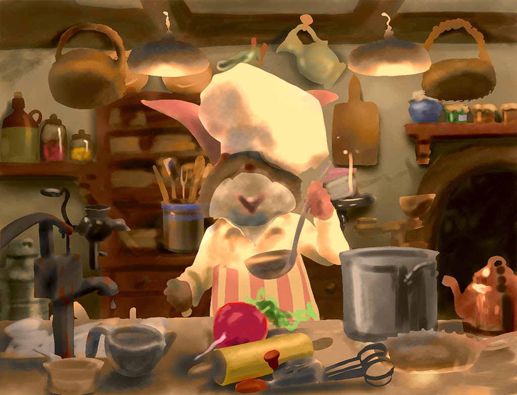
Next I add color, using color layers and Hue/Saturation layers set to colorize. This ensures that the value structure is preserved. I don't always divide the value rough and color rough into such clearly different steps, but for this picture it was an easy way to handle the large amount of content. I use a combination of individual color layers clipped to each separate painting layer, and "global" color layers at the top of the stack to affect the entire image.
Look at how even at this very early stage, parts of the picture (like the jars at the left) are starting to look real and convincing, almost like a blurred photo (click for a detailed version). At this point I merge the color layers down to each individual painting layer so I'm back to having just a few painting layers. For the "global" color layers I first clone them (one for each painting layer), then merge them down.
COMPLETE LIGHTING
It's not arbitrary that I lay in the full range of values from specular highlight to deep reflected darkness on, say the teapot, right at the start. You will not create the illusion of a real environment if you don't represent all aspects of the light in that environment. To put it literally, you need to have a white, a black, a red, a blue, etc. but also you might want to think about having a shiny thing, a not shiny thing, and so on. The only way we see light is by the things that reflect it... so if you want to have light, have different things reflecting it... that is, have things that reflect it differently. In this way the only common denominator is the light itself, and that's what the viewer will see. That is how you paint light.
If I turn the drawing layer back on, which re-introduces some of the little occluded areas and dark accents, viewed small this almost looks like it could be a finished painting. The back wall, with its well placed shadows and organized value structure looks almost complete.

RENDERING THE DETAILS
Ok, that was the fun part... but seriously, I know if I had labored over a detailed drawing, that last thing I'd feel like doing is going back and redrawing those things in paint! But, with this process I've only spent a few hours on the picture at this point, and am psyched to buckle down and just render, knowing I have a really solid foundation in which to paint the individual elements.
LOOK AT STUFF!
There is no greater thrill for me, nothing that is more pure fun than being able to paint a picture like this entirely from my head. That comes from spending a lot of time just looking at stuff. Studying everything I see to understand what makes it look the way it does. What makes something look shiny, wet, transparent, shiny and transparent, soft, hard, etc.
GETTING THE BIG PICTURE
Even though my design was solidly established, it's impossible for it to be complete when the various elements are only roughed in. As I add detail I continually reassess how the picture is holding together, and look for new opportunities to improve the design. I do most of the painting at 25% or 33% zoom, so the whole picture fits on my monitor (usually). But I also keep Photoshop's Navigator panel open at all times, so I can get some distance on the picture, like a thumbnail, without being distracted by details. This makes it really obvious when elements are not fitting into the overall design.
SWITCHING GEARS
When I work a picture like this it really feels like there are two entirely different processes going on, and I am switching back and forth between them every hour or so.
When I'm working on finishing a specific element, say, a cup or dish, I'm thinking more like a scientist, more objectively - how is the cup reflecting the different lights? Where does that highlight go? What color needs to be right here to pick up some of that light reflected back off the thing that's next to it? What is the shape of that ellipse? and so on.
Alternately I am viewing the whole picture using just gut feel. Is my eye stuck over here for some reason? Why is that? Am I getting a red/green vibe in this area? Is this or that element separating from the picture, or pulling my eye? Are all the pieces working together to create the whole I want? Does the picture have the impact I want? I say this is "gut feel" because often the problem is not what it seems. To give a simple example, you may want the eye to be drawn to a certain spot, and in trying to make this happen you may only do things to that spot, when the real problem is that some other spot is pulling the viewer away. If you just keep staring at your desired focal point trying to figure out what's wrong, you will never find it. You have to listen to those little voices in your head that hint something is going on over there...
So I work back and forth between tightening the painting in specific areas, and making comprehensive adjustments to the composition as those painted pieces start to emerge in detail.
THE BEST OF BOTH WORLDS
3d reality principles are not the same as 2d pictures principles. With realistic painting we need to balance the two as best we can. These two ways of viewing the picture can come into conflict, and generally the latter one wins. So for example if that perfectly placed highlight is stealing too much of the show, off it comes. It's paradoxical, but a picture looks more "real" when you can get all the parts to fit together as a 2d composition, even if that means overruling some laws of 3d reality. I think it was John Singer Sargent who said, "paint the hand the way it looks when you are looking at the face." Though in this picture I need to have everything pretty crisply rendered, the principle of getting the right simple gist of each element still applies.
DIGITAL POWER... AND PITFALLS
Being able to move and adjust things at any stage of the process and to make global or semi-global adjustments to a picture are obviously two of the key strengths of digital painting vs. traditional media - but this can be dangerous if you allow yourself to defer working out issues until too late in the process, or avoid committing to pictorial decisions due to endless experimentation. YOU NEED TO HAVE AN IDEA even as you remain completely open to new ideas and refinements as they present themselves.
FINAL TWEAKS
At last I add details that sit over the main forms, such as the various splatterings and mess of the kitchen. And I do some big adjustments to the lighting, adding atmosphere to the lamps, and pulling the focus into the face a bit more.
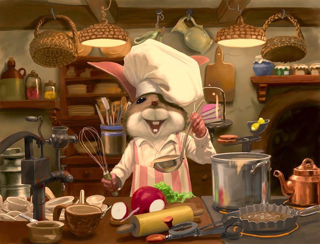
THE FINISHED PAINTING
A few more details, and there you go!
Time to go back to your own kitchens and see what you can cook up!


