Tuesday, March 24, 2015

Of Mice and Monks


Folks have been asking about my process lately, which in some ways I gather is different from many other painters.

This is a pretty simple image I did for Maurice's Valises: The Muuha of Bang Bua:


DRAWING
I start with a really simple rough, but only do the bare minimum needed to give me a guide for painting.
As usual my rough sketch is pathetically simple


Lately I have been developing preliminary drawings a bit more


VALUE
The critical parts of an image like this are the value and color plans.  I CANNOT STRESS THIS ENOUGH. If this work looks really solid and polished it's not because I spend a lot of time polishing - it's because I set up the basic value relationships via careful observation and adjustment.

Lately I've been setting up my images in value first, then adding color, then painting.

I do all this preliminary value work on a single layer with a big soft brush, because it needs to be very direct and spontaneous.

The basic value layout shown under the sketch


And without the sketch - if your image falls apart without the
drawing, you are likely not hitting a home run with your value relationships.


The second image (without the drawing) is the one I am really looking at.  It already has an almost photographic quality, a certain kind of poetry of authenticity and tangibility, despite having no detail whatsoever and certainly not based in any way on a photo or real scene.

Observe how it appears more finished the smaller it gets (this is a combination of the two, with the drawing being preserved for accents in a few spots such as the eyes):

The smaller it gets, the better it looks


CONTRAST
Contrast is typically fundamental for creating focus in a 2d picture, but NOT for creating the illusion of light.  I cannot stress that enough either - the illusion of light comes from value relationships in perfect harmony - which is often undermined by extreme contrast.

You don't need high contrast or even a very wide value range to create the illusion of light (if that were the case it'd be impossible to do this in a picture, since pictures have a very narrow range of value compared to the real world).

COLOR
If I could only say one thing about color it'd be this: color is relative.  We simply cannot judge colors in isolation.  The same is true of value.  

Color organization systems and other devices (such as color wheels) are necessary for industrial purposes, but for painters these only provide illusory comfort, typically serving merely to mislead and undermine your ability to see - to see what is actually happening right in front of your eyes in that unique one of a kind painting you are working on - which is all that matters.

Initial color plan

Working digitally it's a lot easier to adjust values and colors in context.  When oil painting I am constantly painting little swatches of paper and holding them up to the canvas. With digital work I can lay down any color and adjust it, then use that to paint.


PAINTING
With such a solid foundation nothing can go wrong now!  It's just a matter of continuing to subdivide the image into smaller and smaller value/color shapes.

Beginning to paint


 Developing the forms

I flip back and forth between painting detail, working out forms like the drapery, then doing bigger adjustments to realign what I've painted with the larger value and color shapes as necessary.  This is unique to digital painting (for me at least) because with digital work I can't paint everything when zoomed out. I need to do some detail work zoomed in, which unfortunately means I can't see the whole image at the same time (Photoshop's navigator panel helps, but its interpolation is somewhat coarse).


The finished painting!

Monday, January 5, 2015

Cooking Up an Organized Mess


With a lot of pictures you don't need (or want) to have detail all over the place.  This can kill the focus, the epicness of the design... but for some pictures you need to have a lot of stuff at a pretty developed level of rendering.

There was a time not so long ago that putting together a picture like this would have been really daunting for me. If that's true for you now, take heart!  Onward!!!  A lot of it is learning to go back and forth between the small stuff and the big stuff.  The details and the design, so to speak.

PREPARATION
As usual I didn't start this painting with a very detailed drawing.  For ideas I looked at lots of different kitchens, historical and modern.

Here's the initial rough:


I scan that and clean it up in Photoshop:


I don't like having to draw something all nice and clean and detailed, and then also paint it afterward. I like to just have an idea of what I am going to paint, then paint it directly.  Also once I start dealing with value and color I find that compositional issues change, and new opportunities emerge.  With digital media I don't need to do separate composition and value studies.  I decide the basics of what I want to do, then set up my image specifically in a way that allows me to work these issues directly in the final picture, and create the final forms directly in the "paint" vs. with line.  But I have to set up my image such that I can control and manipulate the different pieces as I go, which basically means putting them on different layers.

LAYERS
As far as organizing your layers, you really need to find what works for you.  Don't assume what works for me or your favorite artist will work for you.  Having every single element on its own layer theoretically would make a lot of the painting process easier BUT for me it totally kills the spontaneity, which is absolutely critical for achieving creative flow, getting in the groove... you notice something, you go there and paint it. Fumbling through a huge layer stack is a drag!!!

So I group things into a few color coded layers. Using the lasso select tool I quickly trace each object, then fill with solid gray on a separate layer for each set of objects.  I color the layer itself in the Layers panel, and I make a little color key, like this, that I keep open at all times. Each color corresponds to a single painting layer:


This allows me to navigate the layers panel really quickly. If I want to paint one of those baskets, I go to the blue layer in the panel.  Rolling pin, that's the yellow layer.
VALUE, VALUE, VALUE!
If I've told you kids once I've told you a thousand times - it's all about value!!  Please believe me!!!!!!!!!!!!!!!!!!!!  Value organization is critical to a painting, both in terms of the abstract design and the believability of the space.


Even though my picture is already divided into layers, I do my value rough on a single layer, because it needs to be super-spontaneous and "big picture." I need to be able to paint a big dark swath over there that subsumes all the stuff in it, without having to go back to a bunch of individual layers and try to mimic that global blob of darkness, for example. Once I have something going that looks solid, I duplicate that value layer, clip one clone (Create Clipping Mask) to each of the separate layers, and merge down. So it still looks the same as the single layer value painting, but it's actually divided up into separate layers according to the color key.


COLOR
Next I add color, using color layers and Hue/Saturation layers set to colorize. This ensures that the value structure is preserved.  I don't always divide the value rough and color rough into such clearly different steps, but for this picture it was an easy way to handle the large amount of content. I use a combination of individual color layers clipped to each separate painting layer, and "global" color layers at the top of the stack to affect the entire image.

Look at how even at this very early stage, parts of the picture (like the jars at the left) are starting to look real and convincing, almost like a blurred photo (click for a detailed version).  At this point I merge the color layers down to each individual painting  layer so I'm back to having just a few painting layers.  For the "global" color layers I first clone them (one for each painting layer), then merge them down.
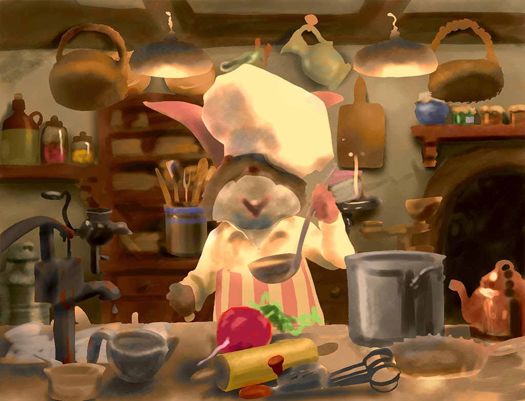

COMPLETE LIGHTING
It's not arbitrary that I lay in the full range of values from specular highlight to deep reflected darkness on, say the teapot, right at the start. You will not create the illusion of a real environment if you don't represent all aspects of the light in that environment. To put it literally, you need to have a white, a black, a red, a blue, etc. but also you might want to think about having a shiny thing, a not shiny thing, and so on.  The only way we see light is by the things that reflect it... so if you want to have light, have different things reflecting it... that is, have things that reflect it differently. In this way the only common denominator is the light itself, and that's what the viewer will see. That is how you paint light.

If I turn the drawing layer back on, which re-introduces some of the little occluded areas and dark accents, viewed small this almost looks like it could be a finished painting. The back wall, with its well placed shadows and organized value structure looks almost complete.


RENDERING THE DETAILS
Ok, that was the fun part... but seriously, I know if I had labored over a detailed drawing, that last thing I'd feel like doing is going back and redrawing those things in paint! But, with this process I've only spent a few hours on the picture at this point, and am psyched to buckle down and just render, knowing I have a really solid foundation in which to paint the individual elements.


LOOK AT STUFF!
There is no greater thrill for me, nothing that is more pure fun than being able to paint a picture like this entirely from my head. That comes from spending a lot of time just looking at stuff. Studying everything I see to understand what makes it look the way it does. What makes something look shiny, wet, transparent, shiny and transparent, soft, hard, etc.


GETTING THE BIG PICTURE
Even though my design was solidly established, it's impossible for it to be complete when the various elements are only roughed in. As I add detail I continually reassess how the picture is holding together, and look for new opportunities to improve the design.   I do most of the painting at 25% or 33% zoom, so the whole picture fits on my monitor (usually).  But I also keep Photoshop's Navigator panel open at all times, so I can get some distance on the picture, like a thumbnail, without being distracted by details.  This makes it really obvious when elements are not fitting into the overall design.


SWITCHING GEARS
When I work a picture like this it really feels like there are two entirely different processes going on, and I am switching back and forth between them every hour or so. 

When I'm working on finishing a specific element, say, a cup or dish, I'm thinking more like a scientist, more objectively - how is the cup reflecting the different lights? Where does that highlight go?  What color needs to be right here to pick up some of that light reflected back off the thing that's next to it? What is the shape of that ellipse? and so on.  


Alternately I am viewing the whole picture using just gut feel. Is my eye stuck over here for some reason? Why is that?  Am I getting a red/green vibe in this area?  Is this or that element separating from the picture, or pulling my eye? Are all the pieces working together to create the whole I want?  Does the picture have the impact I want?  I say this is "gut feel" because often the problem is not what it seems. To give a simple example, you may want the eye to be drawn to a certain spot, and in trying to make this happen you may only do things to that spot, when the real problem is that some other spot is pulling the viewer away. If you just keep staring at your desired focal point trying to figure out what's wrong, you will never find it. You have to listen to those little voices in your head that hint something is going on over there...

So I work back and forth between tightening the painting in specific areas, and making comprehensive adjustments to the composition as those painted pieces start to emerge in detail.

THE BEST OF BOTH WORLDS
3d reality principles are not the same as 2d pictures principles. With realistic painting we need to balance the two as best we can.  These two ways of viewing the picture can come into conflict, and generally the latter one wins. So for example if that perfectly placed highlight is stealing too much of the show, off it comes.  It's paradoxical, but a picture looks more "real" when you can get all the parts to fit together as a 2d composition, even if that means overruling some laws of 3d reality.  I think it was John Singer Sargent who said, "paint the hand the way it looks when you are looking at the face."  Though in this picture I need to have everything pretty crisply rendered, the principle of getting the right simple gist of each element still applies.


DIGITAL POWER... AND PITFALLS
Being able to move and adjust things at any stage of the process and to make global or semi-global adjustments to a picture are obviously two of the key strengths of digital painting vs. traditional media - but this can be dangerous if you allow yourself to defer working out issues until too late in the process, or avoid committing to pictorial decisions due to endless experimentation.  YOU NEED TO HAVE AN IDEA even as you remain completely open to new ideas and refinements as they present themselves.


FINAL TWEAKS
At last I add details that sit over the main forms, such as the various splatterings and mess of the kitchen.  And I do some big adjustments to the lighting, adding atmosphere to the lamps, and pulling the focus into the face a bit more.


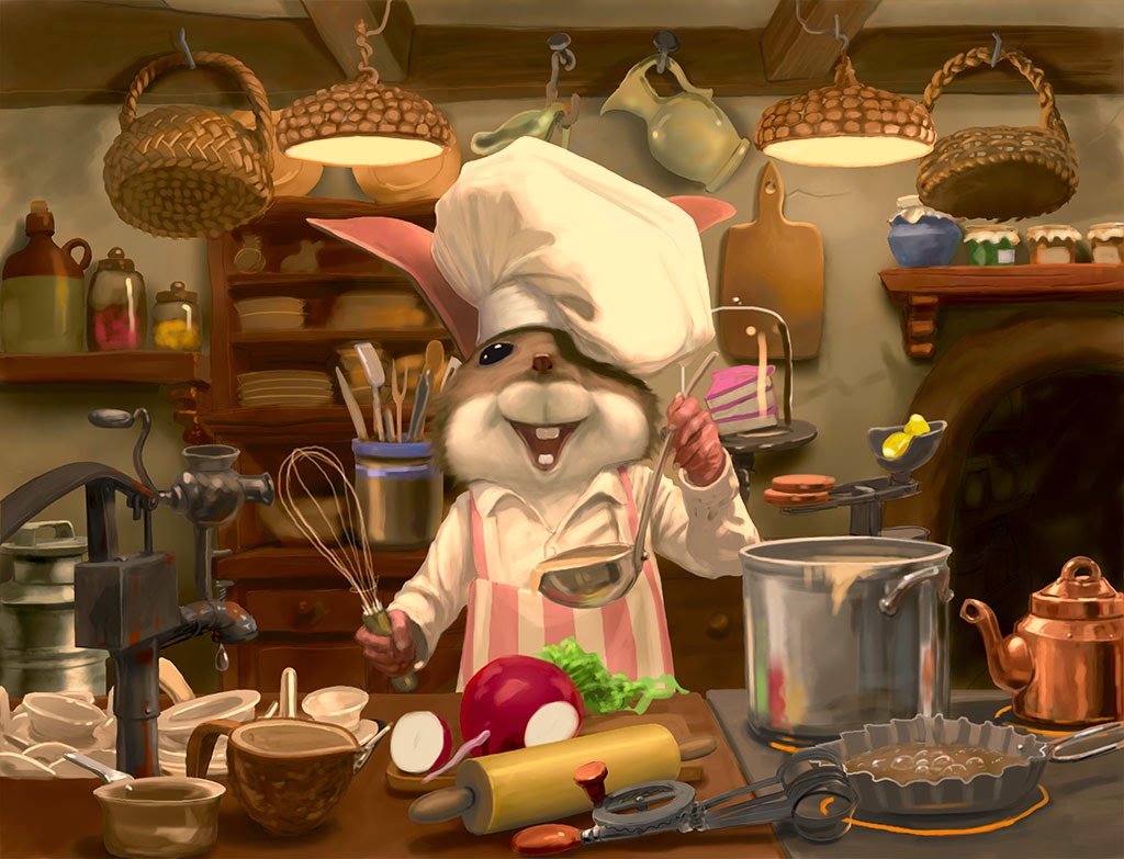
THE FINISHED PAINTING
A few more details, and there you go!


Time to go back to your own kitchens and see what you can cook up!


Thursday, December 19, 2013

A (Traditional) Painter's Approach

Sometimes you have an image in your head that seems so clear... until you try to actually capture it. This scribble may not look like much, but for me it did a pretty good job of getting the idea down... just something bouncing around in my head after reading The Secret Garden by Frances Hodgson Burnett.


Moving that scribble forward can be quite challenging...
Not quite right...

Finally a good drawing emerges - now to the canvas!


I started with a wash of burnt sienna, to establish the basic shapes and value structure (how many times have we heard that?!).  The white is blank canvas, where I've left it unpainted, or wiped the paint off with a rag. There are some tiny hints of raw umber in there too (the raven, shoes, and occluded areas in the rocks, as well as a bit in the coat). This is just to help me note the darkest darks, and cool areas.


I really want to get rid of those pencil lines so I can get to where I'm only seeing big shapes.  It's kind of  a reversion, but critical for me. For an oil like this I need a pretty good drawing, because it's too tough to move things around later, but at the same time I really want the thing to be born in paint!

Some artists meticulously lay down a detailed drawing first, then carefully paint according to that. Good for them!  I am impatient I guess. I'm also messy, so even if I did a tight drawing I'd likely lose it in the painting process.


A detail of the lay in.


The finished oil, about 24" x 36".  Boy those rocks could sure use some love, anyway...


 A detail of the finished painting
I sure love the look of oil paint


This sequence shows the four step process (three steps painting) on one of the squirrels:

Rough pencil

Single tone lay in

Rough paint to establish colors and shapes


Finished paint

And there you go!


Monday, December 16, 2013

A (Digital) Painter's Approach


Painting and drawing... painting and drawing... what's the difference exactly?  And what do we mean by "painting" anyway (especially when there is no actual paint involved)?  For me painting and drawing are two completely different ways of picture making, and yet, they can coexist quite comfortably in a single picture. Some artists start a picture with a pretty tight drawing. Even if the drawing doesn't have a lot of detail, it accurately represents exactly where the big shapes are going to fall. I used to work this way:


But now I like to keep things really fluid, letting the magic happen as I go, and keeping the process spontaneous from beginning to end.  I like to work with painted shapes, that is, filled in shapes, not lines.  In fact, it was while painting that picture that I started working that way.  It was a transitional piece for me.

I use drawing to explore different compositional and lighting approaches.  The pencil is a convenient tool for quick studies, and by keeping these really small (the below is all on one 4" x 6" page, that's about 100mm x 150mm for my friends across the sea) I can quickly fill in the shapes to get a sense of the core value structure.

Here I made a little a matrix of four possible ways I might relate the two main figures (the big salamander creature and the boy), and how the side light would fall across them, what shadow shapes would be created, in each permutation.

I'm using the pencil to make simple shapes and value areas, not to make lines, nor to show form, or detail. The closeups of the boy's head in the upper right show this very well - I'm just trying to see what kinds of shapes I'm going to get depending on how the light strikes the head, and which way it turns. At this point I'm also not looking for specific shapes, just a general sense of which approach is to have the most potential for a strong and interesting composition, and compelling depiction of the forms. This is the beginnings of what I call a "painting" approach, because mark-making with paint (digital or otherwise) is, generally speaking, not about making lines, but shapes. (Of course, in drawing we make shapes using lines, but you get the point).  This is like fitting together pieces of a jigsaw puzzle.  The downside is this can kill the flow of a piece (that's where drawing really shines), so you need to watch for that.

More doodles, trying to fill my head with the simple shapes and forms of the various creatures that MIGHT inhabit this scene. This is me assembling reference, of a sort.  Keep your eye on that snake to the right of the creature, below.


Rather than do another lengthy step by step, I'm just going to focus on one simple element - the snake on the right of the picture - because this shows really clearly the "painter's" approach to laying in an element and bringing it up to full finished detail.  Many of you "drawers" out there may be afraid to paint without a pretty tight line drawing to rely on, but with digital media the painter's approach is easier than ever!  And don't get me wrong - I'm a drawer too!! (ok, I guess the proper term is "draftsman"... or if you want to get old school, "draughtsman", but anyway), those of you who always draw first and paint later might want to try this, because it can really change the way you see your work, and with digital tools, particularly the ability to work on layers and to make value and color adjustments AFTER adding detail, this approach may be refreshing and liberating.


First I lay in a simple flat shape, representing the silhouette of the snake.  Edge detection is one of the most important aspects of our vision - we need to be able to tell where the snake stops and the tree begins. We need to be able to separate individual elements from the background, in real life and in looking at pictures.  But in realistic picture making, unlike real life, we are concerned with shape for TWO reasons: to represent a thing, in this case a snake, convincingly, and also to create a composition, made up of many shapes. Remember this kids - no matter how detailed or realistic the picture, it's still just a collection of flat (2d) shapes.  An outline or line drawing does not represent this as effectively as a filled in shape does.  Laying in an element in this manner is similar to what some painters call "massing."  There is basically no attempt to show form here.


Now the first indications of form, just barely.  Really this is more about integrating the shape into the picture by making it non-flat, vaguely matching the existing lighting conditions, without really getting into how it twists and turns. Also at this point I'm not worried that much about the colors, because with digital I know I can adjust them later.  It's often about reducing the variables, picking your battles..


Now I am refining the shape, and also showing the form. I refine the shape by moving its edges, so to speak, using an eraser tool and a painting tool.  This is where digital really shines, because it's essentially impossible to do this over a partially painted background in traditional media.  With traditional media I would do this in the rough painting stage, with lots of wetness, adding paint with a brush and removing it with a rag.  With digital I can have my cake and eat it too - I can refine the shape as much as I want, while also seeing it as a "filled in" shape, vs. just a line, AND not messing up what is "behind" it, so I can see right away how it relates to the rest of the picture.  Look at the thumbnail then click on it to get a larger view and see how little information and detail is really there.  Yet, right away I can see exactly how this is going to fit (or not) in the painting.


Finally paint in the little details... it's child's play at this point, because with a solid foundation nothing can go wrong now!!!


And, lastly, some small color and value adjustments to fully integrate the little fellow into the painting (he was popping just a bit too much).  Geez I love working digitally.