Monday, February 27, 2012

Quiet Noise - Painting a City Scene

This is one of four pieces I created recently for an educational publication dealing with poetry:

The brief for this piece called for a "busy city scene: skyscrapers, busy sidewalks and streets filled with cars, trucks, fire trucks, jets in the sky..." - words that would strike fear into the heart of any illustrator working on tight deadlines, myself included!

I started by looking at a lot of city scenes, just to fill my head with the feel of a busy city, and to load up on some of the various content you might see in such a locale.

The poem accompanying this picture is actually about how you often catch moments of quiet amid the bustle of city noise, maybe by ducking into a bagel shop, or whatever. The brief also added, "...perhaps at sunset to convey the sense that quiet is imminent." This was discussed with the editor and we concluded that flipping this around, setting the scene at sunrise would deliver exactly what we wanted, a sense of short-lived quiet soon to be overtaken by the impending day.

Surrounded by a ton of city reference images, I cobbled together this rough. It doesn't look like much, but it has a sense of place and light. The colors are consistent, the values are reasonably well arranged.  There's a very simple color scheme, almost monochromatic (the lights are warm, yellow/reddish and the unlit areas are greenish).


This is a solid context for adding as much detail as I want. When I did this it was almost like rendering a dream image. Parts of it don't make sense, for example, the white square back of the truck is actually facing the wrong way. I'm not sure at this point if that's a one way street or a two way street (or a three way street, by the looks of it). But the right feeling is there - something I personally would never get from doing a tight pencil drawing at this stage.

Now where to start painting? A lot of beginning artists have trouble with that, so I'll say it again - it doesn't matter! Start anywhere. Wherever you feel like starting. Wherever looks easiest. Wherever looks like you have some idea what you might do there. Does any area, when you look at it, give you the feeling, "well I guess I could add some detail to that car..." or whatever? Or maybe, "I guess I could start tightening up the lines of those buildings on the left.

Maybe part of the picture looks pretty good but needs a little correction... sort of like you see a lion's form (or whatever) a cloud, but it doesn't look quite right because the eye is too high... it just needs a little re-positioning of the eye and maybe making the mane more symmetrical. Even if it's just one little thing, like, "I guess I could make the side of that building a little straighter" that's good enough. You just need to get going, then "the other you" will become engaged and take over!

Here's my first pass at adding some detail and tightening things up.

Even though, as I said, I could start anywhere, I want to be careful to not let any one area of the picture get too far ahead or fall too far behind. Once I establish the basic image, then get going, I continually scan for whatever is the least developed part of the picture, whatever is bothering me, and bring that up to snuff. Lather, rinse, repeat.

Stapleton Kearns refers to this as "herding sheep." That is to say, bring all areas of the image along together. Don't think this means all areas of the picture should, in the end, be developed or finished equally. Typically certain areas are much more finished than others. But within this general framework or target, don't let any one area fall too far behind relative to the others, and relative to its role in the overall picture. This is especially critical in a picture like this, because one false move and the thing will absolutely fall apart. In fact, right now that yellow truck is in danger of having that effect...


That little light triangle in the upper left is definitely a problem, definitely grabbing too much attention. At the same time, that relatively little and simple shape is giving some crucial form and space information. It's very often the case that what is making a powerful 3d statement is also at risk of killing the 2d statement. Most of it is going to be trimmed off, leaving just enough of the bottom point to serve my purpose, without being an eye sore. But I'll soften the blow a bit by making that area of sky darker than it logically "should" be, and also making the shape a bit more complex.

 Note how those light lines I added to the building on the right (the window frames) sort of explain the loose, rough brushwork on the side of the building. With little areas of more precise detail in place, the eye easily makes sense of what accompanies them.

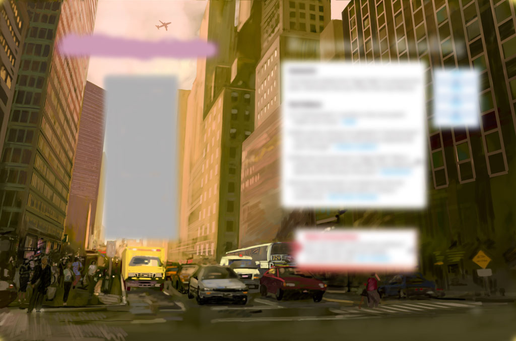
This image shows where the text will be placed over the picture (in case you were wondering about that huge open area of sky.  The placement of the jet plane must work relative to the text. Also, while I could certainly get away with not finishing the buildings behind that huge white text box on the right side of the picture, I want to make sure the picture is presentable as a standalone piece.


Most of the light in this scene is faked, meaning that since there is really no direct light source in the picture (it's sort of all ambient), I can basically do whatever I want with the lighting.  Everything is just generally lit from the top down, and the darkest areas are those that are completely occluded from most light (e.g. under the vehicles).

As is often the case with my pictures, working digitally I could very easily make all those geometric architectural lines perfectly ruler-straight. It's in fact much easier to do this than to laboriously paint them all manually. But that would completely kill the subtle wonkiness that's critical to the picture having a hand painted look. The slight irregularities are part of the texture. I'd rather have the picture look like a freshly painted wooden fence than a perfectly molded plastic one.

Now for some final effects... I darken and enrichify the less lit areas, and add a bright blast of... something, I dunno, pseudo light coming out of the main sky area. This is a good example of where digital tools can be used to add effects, without undermining the hand painted look and feel of the picture.

And, for continuity, here's the final picture again:

There's a saying, "the journey of a thousand miles begins with one step." Take my advice, if you're ever faced with a challenging picture like this, don't procrastinate and don't be afraid. Just start moving. Get going on what you feel you can do, and the rest will follow.

Wednesday, February 22, 2012

Speed, Storytelling and Character

This is a piece I did recently for a magazine:


It's an illustration for an article called "Dances with Wolves", sort of a "man vs. car salesman" thing.

Turnaround times for weekly magazines are notoriously short. In this case the email from the art director came in at 11:00 pm on a Wednesday night.

Thursday morning I received and read the text for article, did some research, and started sketching. The rough sketches went out at 1:00 pm.  It doesn't take that long to actually generate the sketches, but it does take a little time for the ideas to "bake in", so to speak. You really need to get to know the character, his environment, how he might carry himself, how he would dress, etc. If this were an established character I'd only need to worry about conveying his story of the day - but here I need to first establish the character for the audience, and then also tell his current story.  This means (as usual) everything in the picture must contribute to the narrative or it has no place in the scene.  By 2:30pm I had an approved sketch and was ready to paint - the image was due 24 hours later, at 3:00 pm Friday. Of course I was aiming for earlier, and fortunately managed to get it out by 1:00pm Friday.

The art director asked for one sketch - I told him I tried out three or four different approaches, to which he replied, "well don't do that again!" (meaning, "you shouldn't have gone to all that trouble!")

The basic story line is about a customer having to contend with a menacing salesman in order to get the car he desperately wants.

We talked about having the salesman sort of standing as a literal barrier between the customer (and by extension, the reader) and the car:


And more of an evil supervillain kind of approach with the car keys sitting on the desk. He's sort of saying, "if you do exactly as I say maybe you can have this car.":

He went for the last one, my favorite too. We agreed that given the small size (approximately 3" x 3") this would allow us to keep the character's face larger, and also the storytelling was more compelling, slightly over the top (maybe over the middle?). Kudos to Philip for choosing the layout and composition with the most potential, vs. just going for the one that simply happens to have been drawn better (I hate when they do that).

With an approved sketch in hand I got to work setting up the painting.  First I tweaked the rough sketch a bit to make it graphically stronger. Using Photoshop's warp tool I bent and elongated the head, made the arms and body a bit more slender, and made the gesture more unified and powerful. This basically gives the silhouette a stronger footprint, so to speak.

Then I laid in some basic colors and values for the main elements, working under the rough drawing layer.


At this point my main goal is to get past the reliance on the initial line work, so the figure stands on its own with just value shapes. I start painting over the drawing layer, repeatedly hiding it to see if the paint work is solid enough to get rid of the line drawing. Almost there...


Finally I'm able to get rid of the rough line work and get the thing down to a single layer for the figure (plus one for the exterior, one for the window bars, and one on top for the desk).  Now I'm really painting!!


I felt like the blue suit was a bit too colorful, so I toned it down. 


After four hours of painting I went to bed feeling pretty good about where the picture was. "Probably shippable", as we say:


A bit of polish Friday morning... (those white styrofoam coffee cups are so 20th century... and that simple paper key ring had to go).


At this point I "remembered" (that is to say, I re-read the brief), that the character is said to wear "flashy shirts." Oops. Sometimes you get rolling so fast you neglect certain critical details. Thanks to Photoshop, of course, that is not a problem. I tried out a few colors for the shirt: yellow, pink... blue seemed to work best (looks flashy enough, but is not a distraction or focal point).  

I also wasn't happy with how the head was melting into the background a bit due to the character's hair being white (which it had to be) against the light background.  For some purposes this would be great - it actually focuses the viewer on the character's face. But for this application I wanted a little bit more of a flat, graphical appearance. So I added a tasteful (I hope) hint of an outline around the hair (and also added this to some other parts of the figure and the background, for consistency). This is, of course, kind of backwards... but whatever works...

The keys, documents and pen tell the immediate story, that a sale is (potentially) about to happen, while the coffee cup and mouse tell a more general side of the story (this guy's day to day life and routine).The character's facial expression and body language tell who he is in the general sense (his predatory mode of operating) and also what he's doing to the customer / reader right now.I think this is a good example of some simple but concise storytelling - just a few components to create the character, place him character in his setting, indicate what's going on, involve the viewer as well - all driven and tied together by some basic triggers that anyone can easily read and understand.  

Monday, February 13, 2012

Painting White Part Two - Color

If you haven't already, please check out Part One of this little series, which talks about how to create the illusion of white with proper value organization. Now onto color.

Ok, the color you use doesn't matter. The end.

What's that, you want more... ok, here we go...

As discussed previously, an object's reflective properties determine what wavelengths of light it reflects back, which also determines how much overall light is reflected. In layman's terms we can say simply that a red object reflects red light. As a side note, it's important to realize that just about every object in the real world reflects back a little bit of every color. That is to say, even the reddest red apple is not really all that red!

What color does a white object reflect then? All of them (same with black and gray, but we'll deal with them later). As such, white objects and surfaces tell us a lot about the lighting conditions in the given area of a painting (or in the real world, for that matter).  So a white sheet in bright sunlight appears very nearly white; in shadow on a sunny day it may almost appear to match the blue sky (because only the ambient light of the sky reaches the shadow); if a red apple is sitting on the sheet then you'll see some reddish colors  in the apple's shadow, and so on.

That's how it all really works, but in painting "reality" is only part of the story... Because value is soooo overwhelmingly important in visual perception, the fact is, the colors you choose to use in painting white don't matter all that much, in terms of potentially appearing to be "wrong."  The question is, what do you want to do with color in your picture? The way white is handled in a picture tells what the artist is doing, because all other color factors have been filtered out, so to speak.

Sometimes there is a clear logic behind the handling of white, for example, here the warm light of the fire hits the  white surfaces facing it, giving them a yellowish color, while those facing the other way (ostensibly lit by the purply sky) are cooler:


In this picture there is no such logic - the "shaded" areas of the white shirt are colored yellow simply so they harmonize with the strong yellow background. Many times it works great to simply paint your whites in colors pulled from the rest of the picture. Maybe that has the same sort of effect as "ambient light"...
These whites could have been painted very cool, which is probably how they would really appear in "reality."

In practice artists tend to move freely between logical color, abstract color, and color for design.  The good news is, if you have your value organizations right, you have a tremendous amount of flexibility in how you handle color, without fear of the picture breaking apart. This is true of all colors, but as noted, observing how white is handled in a picture really exposes the underlying color approach. Check out all the "whites" in this picture:

Sure the warmer colors are allegedly coming from the lamplight, and the cooler colors from the sky, but as you can see I am able to move quite freely between blue, purple, red, pink, yellow, orange - whatever I want to make the kind of impact I want - without worrying at all about the picture's color becoming incohesive (spell checker tells me that's not a word, but I like it). Here's a selection of these "whites" from the snow scene, in isolation:


It can be really stunning to see that, basically any color can appear as white. Here are some notable examples of "whites" from a few of my pictures - a very wide range of hues, saturation and values:

And, for reference, the larger versions of the pictures these "whites" come from:


So if you're ever looking at some amazing painting of a white tablecloth, with all sorts of pinks and purples in the shadows, and wondering how on earth the artist could have mapped all those colors out, or observed them so carefully... remember that there is a lot more flexibility in how you handle the color of white than you may think.

Tuesday, February 7, 2012

The Walled Flower - a little perspective

This is a cover piece I did for a book called The Walled Flower, just released today!  It's the second in a series of murder mysteries set in Victoria Square, New York (appropriately named "The Victoria Square Mysteries").

The picture had to communicate that the house was under some renovation, without making it look dilapidated. I didn't simply copy an existing Victorian house, but rather designed my own after looking at a few dozen of them (thankfully the area where I live is rich in houses something like this).

Here's a detail of the image


As usual, this picture started with some thumbnails


Followed by some sketches...
You can see how I played around with the different foreground elements: the truck, the cat, the sign.  The cat is a necessary element for all books in the series! The art director went with the third sketch.

I proposed adding the sign with the SOLD sticker for a couple of reasons:

1) to show that the house had recently been purchased (the book follows the adventures of its new owners)

2) to create a nice foreground element, allowing me to bring the cat forward, and therefore make him(her?) larger and more prominent, without standing out too much.

I think this is a great example of where narrative (storytelling) meets design (composition) in illustration. The SOLD sign is a great marker for "something has changed, and now interesting is going to happen." Lots of great stories start with someone moving into a new home.


For perspective, I usually just lay down a series of color-coded lines, each on a different layer, so I can hide and unhide them separately as needed (having them all visible at once creates a lot of clutter).

I don't necessarily make lines that exactly coincide with the main lines of the house - I just makes sure the lines are abundant and closely spaced enough that I can estimate pretty much any line I need to paint with some accuracy.

The house basically uses three point perspective (doesn't everything? - yes); in this image I used red for the upper vanishing point, i.e. the verticals (because we are looking up at the house), blue for the left vp, the green for the right (and black for the peaks - vp's four and five, but who's counting?).

For the lettering on the sign I used a little time-saving technique. First I quickly painted a rough version of the sign flattened out. I designed it to look something like a generic real estate sign:

Then I applied a perspective distortion, using the aforementioned perspective lines as a guide.

Because I want to maintain the painterly quality of the image, I have to be careful not to be too precise with the sign. So I use it just as a quick guide, which I then paint over. It's kind of ironic - with physical paint you may struggle to make the lines of the sign as straight as possible - with digital that's trivial, so you have to make some effort to NOT make them too straight. You have to resist the urge...  Here's what the final painted sign looks like:
Observant viewers will notice the extreme shift in ambient and reflected light on the right or "shaded" side of the post. The upper part of the post reflects a lot of blue-purplish sky light, while the bottom portion reflects a lot of the greenish color from the lawn. This may look exaggerated here - but did you notice it earlier?

Here's the cover for the first in the series, called A Crafty Killing, which I also did:

The Walled Flower is available today, and can be purchased at your local bookstore, or from Amazon or Barnes and Noble.

Wednesday, February 1, 2012

Maurice's Valises on iTunes

I'm thrilled to announce that the picture book I recently illustrated, Maurice's Valises (Moral Tails in an Immoral World), part one: The Beginning is now available on iTunes!

I had an amazing time collaborating with the author, J.S. Friedman on this wonderful project.
The iBook features sound effects, narration and animation!


You can purchase the iBook or download a free sample by clicking on the link above, or here.